Keydom Games
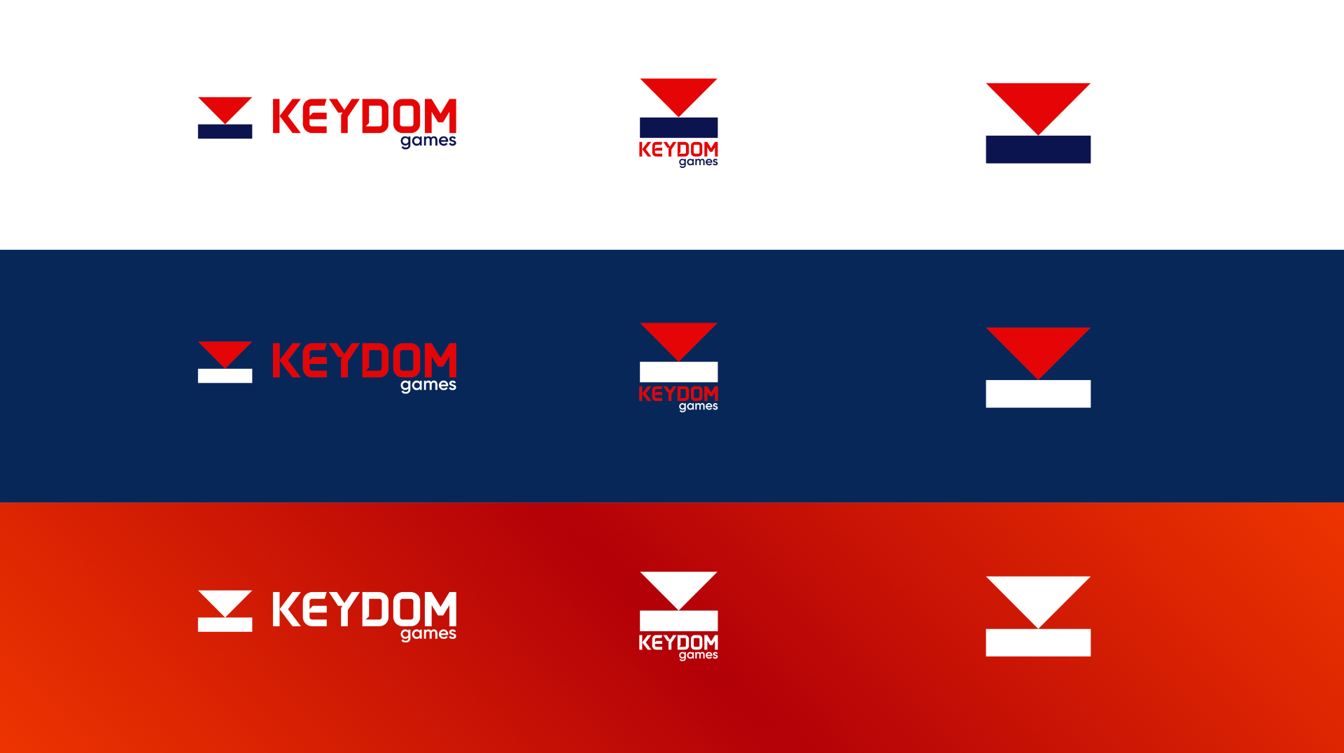
Keydom Logo.
About the brand
A bold new brand identity for Keydom — a digital games e-commerce store and online marketplace. We merged key and crown into one ownable logomark that reads as “key” + “dom” (kingdom), paired with a custom serif-style wordmark and a modern red-gradient/navy colour system built to work across storefronts, product pages, packaging, merch and social.
Keydom came to us to build an identity that felt playful and premium at the same time — a mark that could live on a storefront, a product page, a shipping box, a hoodie, or a controller. The name itself was the brief: “key” plus “dom” (kingdom). We set out to create a logomark that merged a key silhouette with a crown feel, so the store name reads instantly and the brand owns its space.
The challenge
Games retail branding tends to sit at two extremes: overly cute mascots or generic tech wordmarks. Keydom needed a mark that felt confident enough to headline a marketplace, flexible enough to work as a small favicon or app icon, and warm enough to feel like a community — not a corporation.
The solution
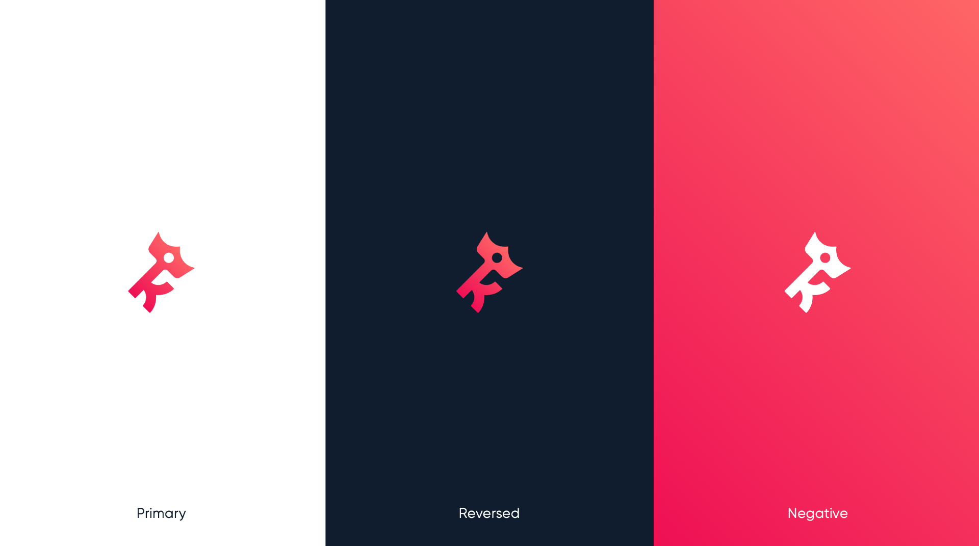
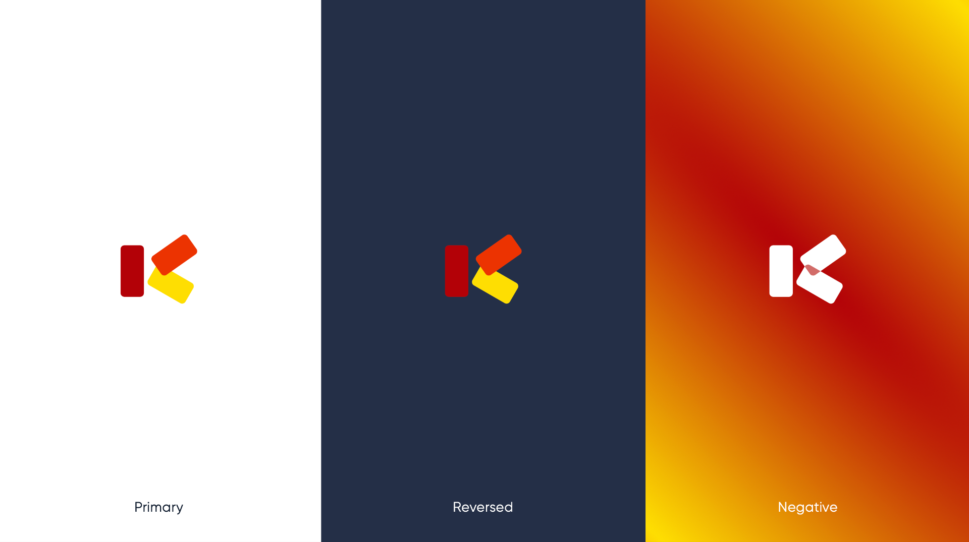
We landed on a stylised key character that doubles as a crown — the teeth of the key forming a subtle regal peak, tying “key” and “dom” together in a single continuous shape. Rotated 45 degrees, the mark feels dominant, eye-catching and full of energy. The wordmark is built from a semi-custom serif-style logotype using Made Tommy Soft as the primary typeface, with Kanit as the secondary branding typeface. A warm pink-to-crimson gradient sits against deep midnight navy, giving Keydom a modern, confident palette that works in full colour, reversed on dark, and as a solid negative lockup.
Our thinking
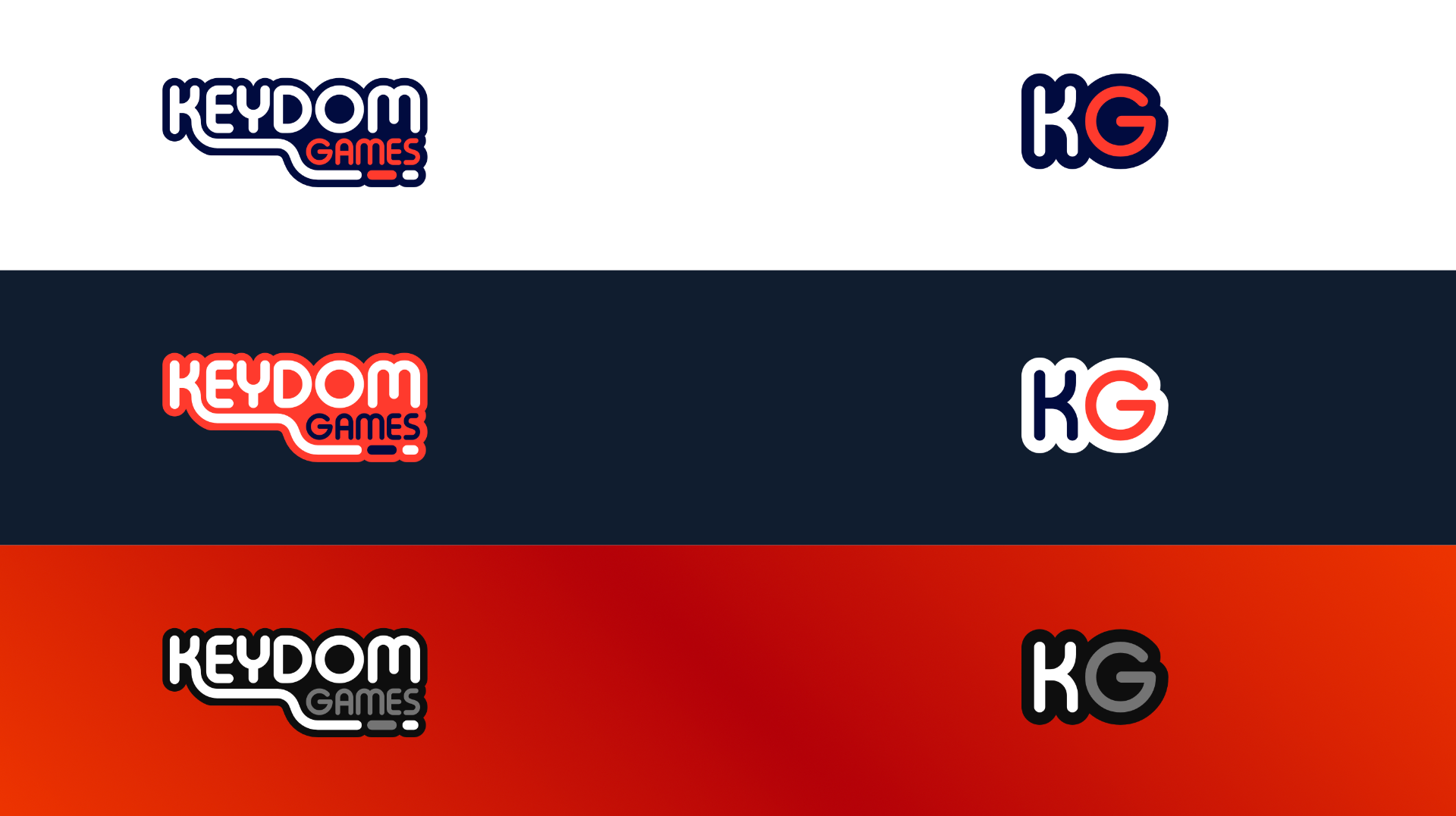
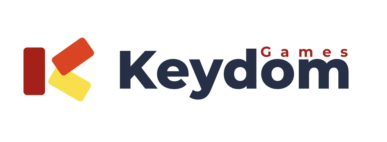
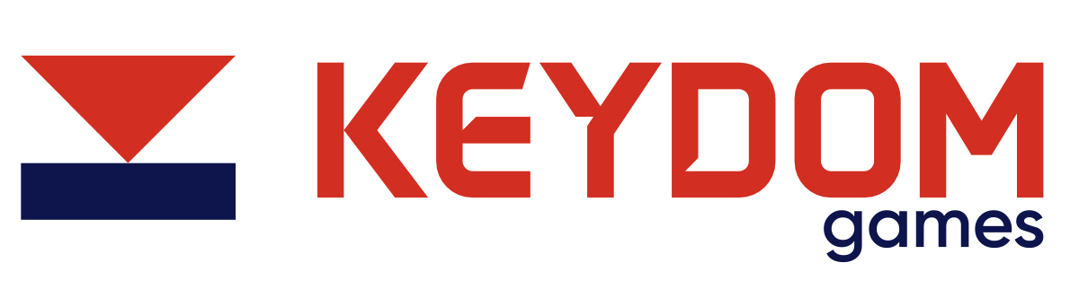
We explored four distinct directions in parallel — an arcade-inspired outline wordmark, a stacked geometric “K” monogram, a red/navy triangle mark, and the key mascot. Each was tested at scale, in reversed and single-colour treatments, and stress-tested against storefront and packaging mockups before Keydom picked the mascot route.
Logo variations
Palette
Coral
#F5455C
Crimson
#E5385A
Navy
#0F1A2E
White
#FFFFFF
Results
Delivered primary mark, reversed and negative lockups, full colour palette and monogram — ready to roll across storefront, product packaging and social.
Need a brand this sharp?
Let's talk about your identity: logo, palette, and the story that ties it all together.
Start your brand